Ninja reveals new branding, and fans hate it
Twitch’s original superstar Tyler “Ninja” Blevins has just announced a new logo and branding. But it may not have been the glow-up Ninja was hoping for.
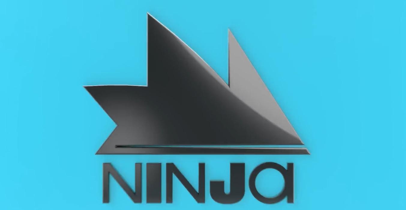
On Twitter, Ninja tweeted to his 5.7 million followers that his new branding had finally arrived. The fresh rebrand features black letters of varying thickness below a spiky shape representing his signature blue hair. This would replace his usual logo, which featured a ninja-like cartoon version of his head with his headband and hair on top.
Ninja also announced a new merch line along with it, featuring the neon blue hair prominently on the shirts and hoodies. This new merch was quite simple and clean compared to some of the louder designs, possibly an attempt at a more mature style from Ninja.
Ninja fans make fun of new branding and logo
Unfortunately, the rebranding wasn’t the huge hit that Ninja had been hoping for. The initial announcement was immediately met with negative reactions from fans in the gaming community.
A lot of the criticism was aimed at the lettering. The blend of thick and thin letters threw some people off and wasn’t visually pleasing to others. Others said it was just plain hard to read, noting that it looked like “Ninjoi” at first.

Another common complaint was that the logo looked very similar to the Twitch Prime logo and branding. Twitch Prime’s logo features the usual Twitch cube sporting a crown with three spikes. Since Ninja’s hair also has three spikes and both are blue, it feels awfully familiar to many in the streaming community.
Overall, many fans just found the redesign ugly.
Ninja hasn’t responded to the negative comments about his new logo and branding. He has retweeted some of the positive comments, however, showing that he most likely has looked through the responses.
Recommended

“How is your wife?”: Destiny and Ludwig beef gets personal
“He’s really burning bridges he never had for no reason.”

MoistCr1TiKaL is suing US Immigration after losing his Moist Esports Apex Legends team
He wants his Apex Legends team back.

Sykkuno announces Twitch comeback in a surprise stream
Just like old times.


