Win.gg
Dota 2
LGD Gaming gets put on blast by fans for strange new logo LGD Gaming gets put on blast by fans for strange new logo
LGD Gaming is 10 years old now.
The organization is commemorating the occasion in a number of different ways including giveaways and some highlights of the team’s history. The most recognizable part of LGD’s birthday festivities has been the reveal of a new logo that leaves behind its enduring but bland former lettering in favor of something more stylized.
The new logo was revealed on Twitter and was quickly proliferated across social media. As is almost always the case with rebrandings, fan response was resoundingly negative.
“Ummm, do LGD Gaming need to take advice from Virtus.pro,”
asked
Dota 2 caster Toby “Tobiwan” Dawson, a reference to Virtus.pro’s popular
new look
for The International 2019.
“Am I the only one who sees the man with hands up?” questioned one fan on Twitter.
Worst of all were a number of debates regarding what the stylized lettering in the logo actually looks like. Fans stated that the logos actually read “Gaming LGJ” or even “Gaming UGJ” rather than “LGD Gaming.”
Fans are already clamoring for a return to the more familiar red LGD Gaming logo that has most recently been in use.

That said, LGD’s rebrand is far from the worst seen in esports.
LGD Gaming new logo still better than most
Rebranding is difficult in any industry. Recognizable brands like the Gap and Mastercard have rolled out new logos and quickly reverted back after poor reception from customers. Tropicana did the same, but only after dropping its iconic “orange with a straw” logo led to a steep decline in sales.
With many esports brands starting as grassroots endeavors and transforming into multi-million dollar companies, it’s no surprise that the industry has seen more than a few notable rebrands in recent years. Some, like ESL’s move from its traditional black and baby blue color scheme to the neon green and yellow of today, have turned out fairly well. The vast majority have been poorly received, however.
Earlier this year, Complexity Gaming shed its enduring colors and hurricane logo in favor of a look inspired by the Dallas Cowboys, the football organization it shares an ownership group with. This was followed by NRG Esports rolling out a
new logo and color scheme. Both of these rebrandings were poorly received by fans.
The rebranding isn’t popular and it certainly comes at an inopportune time as LGD Gaming’s Dota 2 team hit a rough patch that saw it lose in the open qualifiers to the DreamLeague
 Steven Rondina
About Steven Rondina
Steven Rondina is a true lifelong gamer. His earliest memories are of playing video games, and he has continued playing them throughout his life with no plans to stop any time soon. Steven’s favorite franchises in gaming include Pokemon, Dark Souls, and Counter-Strike. He has previously published with Bleacher Report and other gaming outlets.
View full profile
Read Also
 Dota 2
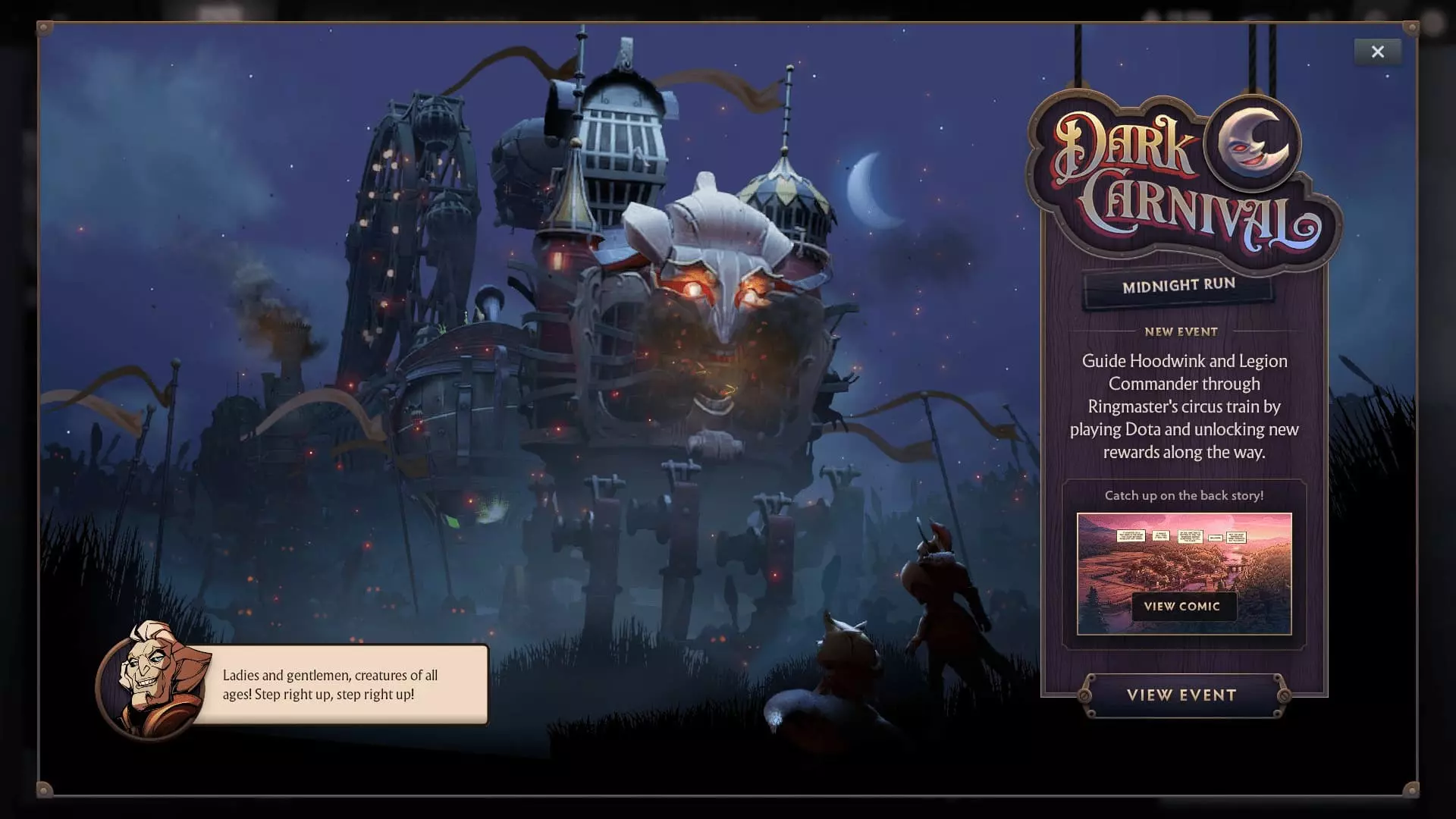
Dota 2 temporarily deletes popular hero before launching huge Dark Carnival update
Michael Hassall
If you were an Axe player in Dota 2 earlier this week, you’d have found yourself out of luck when you tried to pick the stalwart Oglodi warrior, as the hero was straight up removed from the game on June 23. The hero was completely missing from All-Pick and his hero model was replaced with a missing poster. Axe couldn’t even be demoed or picked in a custom game for ...
 Dota 2
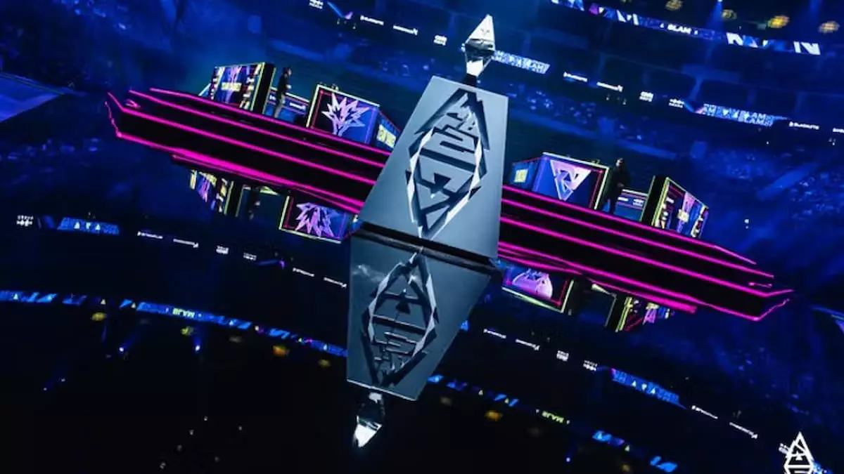
Team Yandex stop the magic, defeating LGD in BLAST Slam VII finals
Michael Hassall
Team Yandex have defeated LGD Gaming in the grand finals of BLAST Slam VII in a dramatic 3-1 series that saw both teams pushed to the limit, but ultimately Yandex come out on top. Concluding the last major tournament before teams head to the Esports World Cup and The International 2026 next month and in August, Yandex were able to counter the momentum of LGD that had brought them into ...
 Dota 2
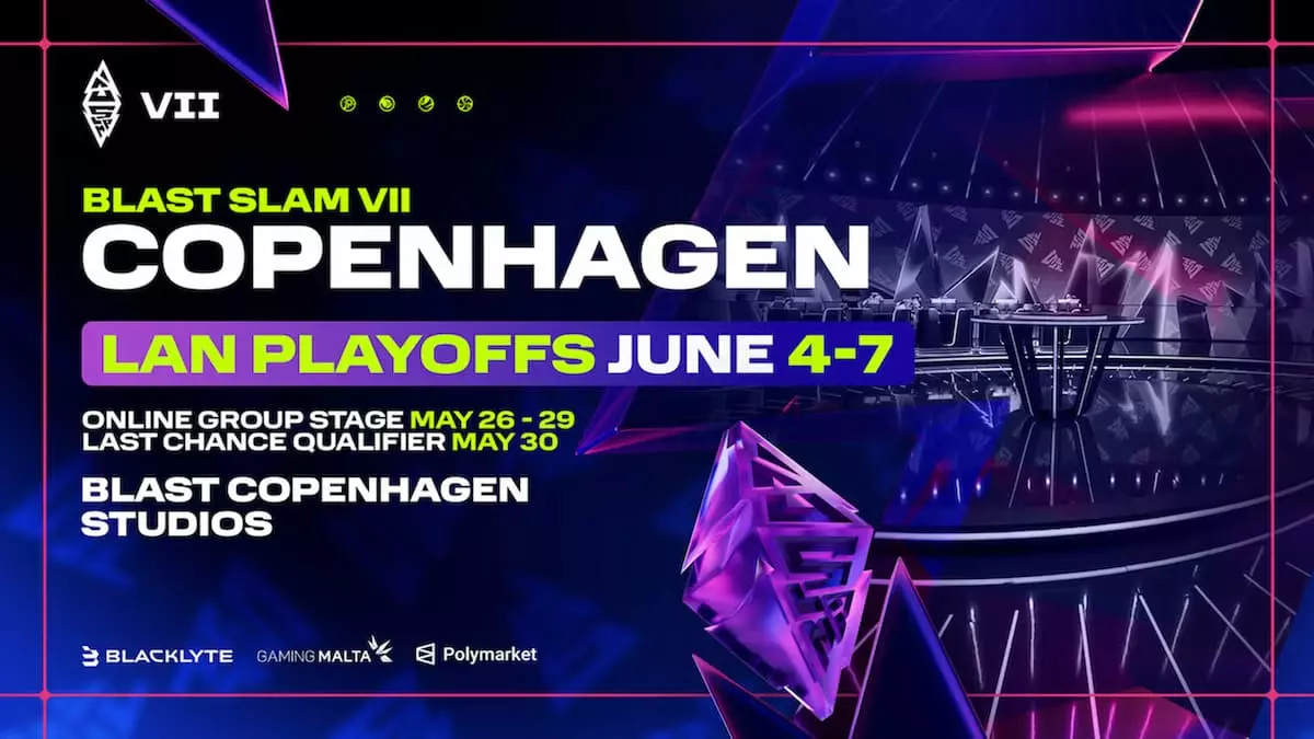
BLAST Slam VII Finals Predictions and Picks – Can LGD make it all the way?
Michael Hassall
LGD Gaming in the top three of a tournament!? What is this 2021? BLAST Slam VII has been one of the most surprising tournaments of the year, and has capped off the pre-EWC and TI season with some of the most thrilling gameplay we’ve seen in months. And the finals are set to be even more exciting. With just three teams left there’s a lot on the line, from the ...
 Dota 2
Easiest Dota 2 Heroes for Beginners – Best Picks to Learn the Game
Simon Day
We can all agree that Dota 2 is a complex game, but starting with the right heroes can make the learning process much smoother. Choosing one of the best Dota 2 heroes for beginners is key to building your skills and enjoying your matches. That’s why it’s time to explore the heroes that are easy to understand, effective in the game and great for learning the fundamentals. Without going into ...
 Dota 2
BLAST Slam VII Playoffs Preview – Visa issues transform the playoff picture
Michael Hassall
BLAST Slam VII is the last major tournament before teams lock-in and compete at the EWC and The International, and as a result, we’re seeing a tournament with some unique outcomes. With teams seemingly treating this as a last-minute tune-up before the championship clashes of the next two months, a South American team has topped the table and some of the best teams in the world are either without players ...
 Dota 2
TI-Champions Tundra Esports exit Dota 2 as roster transfers to 1win
Michael Hassall
Tundra Esports has revealed it’s leaving Dota 2 after six years and a victory at The International 2022. The UK-based organization has announced its roster will transfer directly to 1win for future events. The announcement, posted on Tundra's socials on June 1, confirms rumors and earlier social posts from 1win which hinted at a new lineup. With the move, however, questions about 1win’s existing EEU roster and attendance at The ...
 Dota 2
A full weekend of TI15 tickets will cost you just $280 – If you don’t mind the view
Michael Hassall
Alongside the team invites for The International 2026, Valve today (May 26) unveiled the pricing and details of how to purchase tickets for TI15, and the price is the lowest in years. For years we’ve seen the price of The International Prize, with a peak of around $700 as a lowest price for a full weekend for both 2023 in Seattle, and 2024 in Copenhagen. But after a fall in ...