Evil Geniuses unveils another new logo after fans decry 2019 rebrand
Evil Geniuses has a new look. Again.
The enduring organization has unveiled a new logo that stands as a modernized take on its classic “EG” crest. The letters are a bit easier to decipher than the original, with an extra flair that conjures up the image of a hurricane.
Today dawns a new era—one with a nod to our legacy and a bold eye to the future.
Welcome to the new EG. #LIVEEVIL pic.twitter.com/PE35QfJGpd
— Evil Geniuses (@EvilGeniuses) May 20, 2020
“Iconic. Inclusive. Innovative. Our new Crest pays homage to those who shaped EG’s legacy and serves as inspiration for our players and the esports industry as a whole,” Evil Geniuses said on social media.
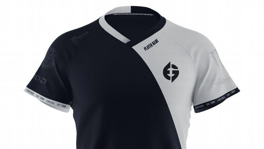
Alongside the new logo was the reveal of new jerseys for players.

Response to the new logo was mixed, which is still a win for any esports organization when it comes to rebranding. Fans have very rarely met any shakeup to a team’s logo or even colors with positivity, with Virtus.pro and NRG Esports taking huge backlash at the time of their own respective rebranding efforts. Evil Geniuses took possibly the biggest hit of all last year, when it unveiled a new logo.
That look was ultimately short-lived, with this new look set to be the standard for Evil Geniuses moving forward.
Evil Geniuses’ new look better than 2019 rebrand
Despite having a long history in classic esports titles such as Counter-Strike and Starcraft, the organization’s visibility has fallen precipitously over the last few years to the point where its only notable competitors were a few fighting game players and its Dota 2 team.
Evil Geniuses underwent major renovations in late 2019, looking to recapture its former glory. The team was shaken up on the business end, which was followed by returns to Counter-Strike and League of legends through the acquisitions of the NRG Esports Counter-Strike: Global Offensive roster and the LCS franchise spot of Echo Fox. To mark this new era, Evil Geniuses underwent a bit of a rebranding, to a resoundingly negative results.
when we rolled out something that took you by surprise in a way that had everything to do with what was missing and not what was unveiled. Im super proud of what we unveiled for the record. I stand for it so hard, and our team is excited to tell new stories with this look & feel.
— Phillip Aram (@Phillip_Aram) December 14, 2019
The classic crest was dropped in favor of a new logo with stylized text, which was met with immediate backlash. The negativity was so overwhelming that Evil Geniuses COO Phillip Aram took to Twitter to discuss the matter at length with fans.
“You, and all our fans who hold their own part of EG in their hearts, felt a lot of anguish when we rolled out something that took you by surprise in a way that had everything to do with what was missing and not what was unveiled,” Aram said at the time.
Recommended

BLAST entering Dota 2 esports with five tournaments
“We have plans that Dota fans haven’t seen before.”

Dota 2 Crownfall update: What’s new?
Exciting, but no Ringmaster.

1win accuses ESL One Birmingham of favoring OG after Visa issues
“Not the Visa curse.”


