CS2 has a new logo and players are just finding out
Valve has silently overhauled the Counter-Strike: Global Offensive logo for CS2 and players don’t like it.
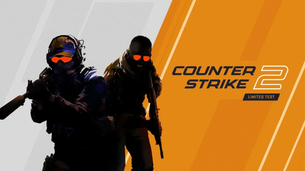
The CS2 logo was initially teased as just text on a full blue background, but Valve later unveiled an updated version. However, no one really noticed the exact change until a player pointed it out in a community thread. The new logo looks the same at first glance but is actually different.
Apparently, Valve has quietly switched colors in CS2 and made other significant changes that went unnoticed. But now that they’ve been highlighted, players aren’t sure if they like them.
CS2 logo is significantly different from CSGO

CS data miner Aquarius shared the image of both CS2 and CSGO logos, highlighting a big color difference. Valve has switched over the blue and yellow in CS2, a change that went unnoticed.
But that’s not what’s bothering the CS community. Players think the shooting model posture is odd, and Valve shouldn’t have removed the details from the weapon.
In the CSGO logo, the player model is holding a weapon that looks like SCAR. But, the gun in the CS2 logo is more abstract, lacking details. No muzzle or magazine detail makes it look like any generic weapon. To top it all, the model looks like he’s about to fall over due to the posture, according to the community. One player even called the logo “offensive,” pun intended.
Previously, the blue came first, and then the yellow, but Valve has silently swapped the colors. So far, no one knows why Valve made the color switch, but one theory makes sense. In the CSGO team selection, T-side is on the left side, and CT is on the right, which may have inspired the change.
In any case, the majority of the players prefer the old logo, which was more elaborate and straightforward.
Recommended

s1mple is offering lessons to help you get good at CS2
Have you dreamed of playing like s1mple?

Recent CS2 ban wave punishes cheaters during live games
Valve is banning players in bulks.

Players hopeful after Valve adds Overwatch to expose CS2 cheaters
Only “trusted” players will be Overwatch investigators.


