Fans aren't happy with new Virtus.pro uniforms
Virtus Pro is going to look very different heading into events like The International 2018 and the FACEIT Major: London, but not because of any roster moves.
The Russian organization revealed a new jersey and logo, ditching its traditional black and orange colors in favor of a new green and purple look. Check it out:
Initial reactions from fans were resoundingly negative, with many saying they missed the previous color scheme and didn’t like the new color pairing. Virtus Pro did receive some praise from within the industry for going with a unique look instead of one shared with other esports organizations.
Though the debate over whether the new jerseys are better or worse will surely carry on, we do know that the change was made as part of a new sponsorship deal with Russian telecom company MegaFon, and that a new logo is also coming soon. Alongside the announcement on Twitter, Virtus Pro General Manager Roman Dvoryankin posted a statement about the team’s new look on the organization’s
official site.
“As part of our partnership starting from The International 2018 and until the end of the year all our line-ups will represent MegaFon brand colors,” Dvoryankin said. “Our logo will change accordingly, as well. As early as November, in celebration of Virtus.pro 15th anniversary, we will reveal the changes to the team’s image starting from 2019 onward.”
Though the first look at the new uniforms wasn’t well-received, the team will hope to deliver something better liked come 2019.
 Steven Rondina
About Steven Rondina
Steven Rondina is a true lifelong gamer. His earliest memories are of playing video games, and he has continued playing them throughout his life with no plans to stop any time soon. Steven’s favorite franchises in gaming include Pokemon, Dark Souls, and Counter-Strike. He has previously published with Bleacher Report and other gaming outlets.
View full profile
Read Also
 Esports Betting
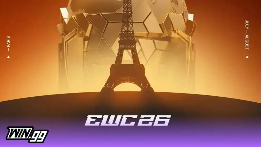
Here’s the complete Esports World Cup (EWC) 2026 schedule
Hannan Mundia
The Esports World Cup (EWC) 2026 has finally arrived, and here’s the complete schedule for the event to ensure you don’t miss anything. While it isn’t exactly the newest name in the esports scene, the EWC has quickly become a leading event for esports fans worldwide. It brings together professional players and fans from various games, combining them into one long event that everyone can enjoy. 2026’s Esports World Cup ...
 Counter-Strike
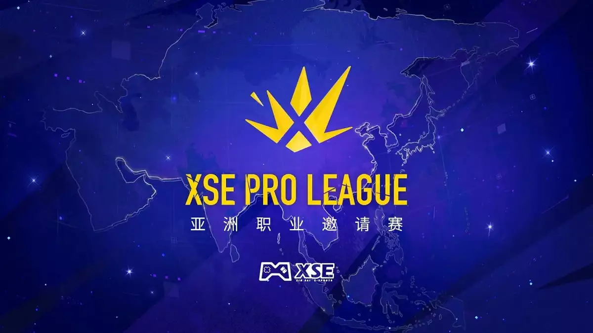
XSE Pro League 2026 in China: Teams, format and prize pool
Owen Harsono
Counter-Strike is back after the IEM Cologne Major, as the XSE Pro League 2026 is the first notable event since then. 16 teams book flights to China to compete in the million-dollar event. Here’s everything you need to know about the XSE Pro League 2026 event. Top-tier Counter-Strike returns to the passionate grounds of China, as the event will take place in the city of Guangzhou. Teams will play in ...
 Esports Betting
Will Valve add Cache in the CS2 Premier Season 5 Active Duty map pool?
Wasif Ahmed
Following the highly anticipated return of Cache to Counter-Strike 2 earlier this season, the competitive community has almost started believing that the legendary industrial map would soon make its way into the Active Duty map pool for Premier Season 5. This expectation followed a pattern set by Train, which Valve brought back late last year before quickly pushing it into the main professional tournament rotation. However, in a recent Twitter ...
 Counter-Strike
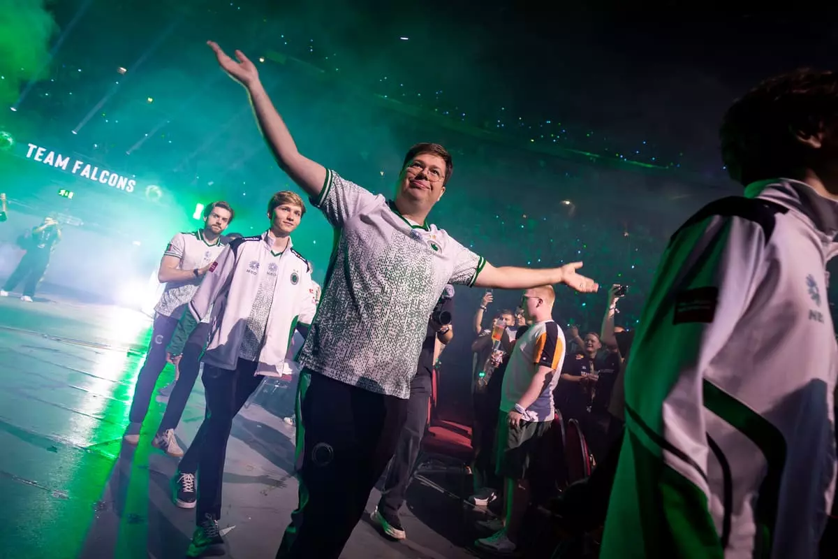
IEM Cologne Grand Final: Team Falcons vs FURIA best betting predictions
Owen Harsono
Coming into the IEM Cologne Major, nobody would have expected a grand final series between Team Falcons and FURIA, but here we are. Will NiKo finally win his first Major, or will FalleN win another one before retiring at the end of the year? Here are our IEM Cologne Major Grand Final predictions. Tournament: IEM Cologne Major 2026 Stage: Grand Final Game: Counter-Strike 2 Format: Best-of-five Betting tip: Team Falcons ...
 Counter-Strike
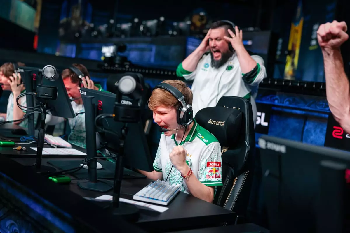
Team Spirit vs Team Falcons IEM Cologne Major: betting predictions and picks
Owen Harsono
We’re in for a treat, as Team Spirit will take on Team Falcons for a spot in the IEM Cologne Major grand final. Will NiKo finally get another shot at winning a Major, or will donk and company prevent him from accomplishing his lifelong goal? Here are our IEM Cologne Major Team Spirit vs Team Falcons predictions. Tournament: IEM Cologne Major 2026 Stage: Semi-Final Game: Counter-Strike 2 Format: Best-of-three Betting ...
 Counter-Strike
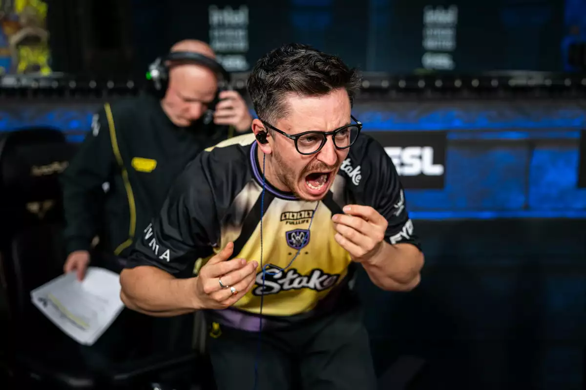
Vitality vs Falcons betting predictions and best picks: IEM Cologne Major 2026
Owen Harsono
We’re treated to a possible grand final matchup here in the quarterfinal of the IEM Cologne Major, with Team Vitality taking on Team Falcons in an elimination match. These are two of the highest-profile teams in the game right now, but only one of them can continue their chase for the trophy. Here are our IEM Cologne Major Team Vitality vs Team Falcons predictions. Tournament: IEM Cologne Major 2026 Stage: ...
 Counter-Strike
IEM Cologne Major 2026 playoffs preview: matchups & predictions
Owen Harsono
The top eight teams at the IEM Cologne 2026 Major are set. Most of the favorites easily secured their spots, but we also have promising underdogs sneaking into the bracket. To keep you up to speed, here’s everything you need to know about the IEM Cologne Major playoffs. We started with 32 teams and are now only down to eight. After a grueling Stage 3, teams have been seeded into ...
