Rating the 2020 LCS Spring Split jerseys from worst to best
The first day of the 2020 LCS 2020 Spring Split has concluded, and most of the teams have had an opportunity to showcase their new jerseys.
LCS players proudly wear their respective team’s colors on stage. Likewise, the teams love promoting merchandise sales and sponsorships by having players look fierce in the jerseys. But not every jersey is equally creative or fashionable, and some make much more of a statement than others.
Here are all 2020 LCS jerseys, rated from the worst to the best.
10. Immortals
Immortals is listed at the end of the list due to a lack of creativity on the team’s new jersey. It’s just a simple black v-cut jersey with Immortals’ logo and a few stripes in the team’s light sea green color. Nothing about IMT’s jersey makes the team stand out.
9. TSM
Team SoloMid kept its jersey minimalistic as usual. Featuring a distant camo, it’s a recognizable black and white jersey. But this year, six new stars shine above TSM’s logo to represent the number of LCS titles, something fans find amusing given the team’s more recent performances and lower standings in the league.
8. Cloud9
Compared to the last year’s creative jersey, Cloud9 seems to have downgraded for the 2020 LCS. Rather than giving an impression of clouds with different shades of blue, C9’s new design makes the jersey look a little bit washed out. The logos on unnecessary black sleeves aren’t ideally positioned either.
7. Evil Geniuses
Evil Geniuses’ new font logo has been criticized ever since the rebrand for a lack of imagination. But the team decided the best way to go with the 2020 jersey is to give the most space to the infamous logo. Besides the huge EG logo and some prominent advertising space for Monster, the jersey doesn’t really have a design.
6. CLG
Another design similar to many others is the 2020 CLG jersey. On a black background, Counter Logic Gaming’s recognizable blue logo is well noticeable, and it’s a nice jersey overall. However, the jersey doesn’t differ much from the last year, and lacks features that would make it stand out from other teams.
5. Team Liquid
A darker shade of blue for the new design resulted in a classy logo for Team Liquid. As with its previous jerseys, the designed focused around the part of the iconic horse logo, with the mane giving it a cool look. As the reigning champion of North America, Liquid placed stars above their crest as the team has won the last four splits.
4. 100 Thieves

Coming in with red for long sleeves and white for short sleeves, 100 Thieves’ new jersey features a modern design that’s not hard to like. With the simplest contrast of colors and a few stripes, 100T’s design resembles classical sports jerseys. Toning down sponsor logos to black or white completes a look nice to the eye.
3. FlyQuest
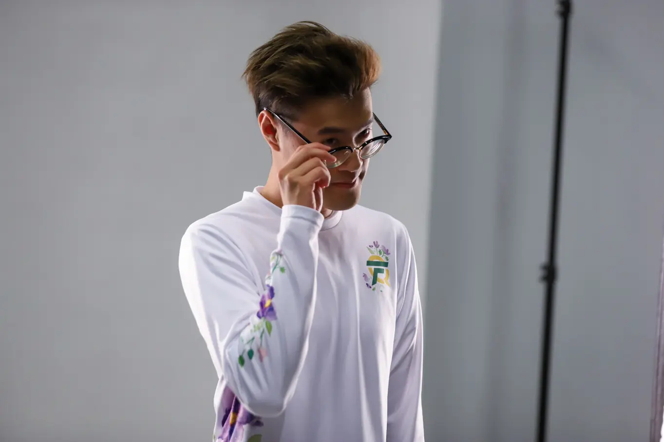
The most unique jersey in the 2020 LCS belongs to FlyQuest. A plain white jersey with a flowery pattern, and the team’s logo incorporated in it, this minimalistic jersey is here to send a message. FLY wants to promote the importance of nature and to motivate its fans to do better to preserve it.
2. Dignitas

Dignitas is back to the LCS with a unique jersey fitting its new brand. In black and yellow, DIG players are wearing camo to demonstrate the organization’s history, with yellow painted over making for a cool design. Players’ home country flags above the tags are a nice touch as well.
1. Golden Guardians

Golden Guardians might not have the best chance to be on top of the 2020 LCS standings, but it wins as the classiest brand of the season. GG’s jerseys should be an example to everyone on how to do a minimalistic design while also making a statement with a nice contrast of gold and black.
Recommended

Can a VPN really lower your game ping? Myths vs. reality
Do you really need it?

MrBeast takes action on Ava controversy, responds to allegations
MrBeast has launched a private probe.


