These are the five worst team jerseys in pro League of Legends
Professional esports teams show off their branding with jerseys worn by pro players and fans alike. Jerseys aren’t there just for comfort on a stage, as organizations also use them to promote their colors and sponsors, hoping to sell more merch along the way.
Ahead of every season, most teams prepare new jerseys. Sometimes entirely new, sometimes just a little bit different. But not every such change is successful, and there are some jerseys we’ll remember for the wrong reasons.
Here’s our take on the worst League of Legends esports jerseys in recent history.
5. Sandbox Gaming, LCK 2019
The best of the worst on the list belongs to Sandbox Gaming’s last jersey. The team’s choice for the 2019 LCK was to place a huge “SG” across a hot red shirt. Not only was it barely noticeable that the black lines read as SG, but the whole image made the players look a little bit like ladybugs, and the jersey wasn’t easy on eyes.
4. SK Gaming, LEC 2019
Nothing screams “we’re sponsored by two huge brands” like SK Gaming’s 2019 LEC gray and pink jersey. With details in German Telekom specific pink and its huge logo in the middle, and Mercedes’ logo just on the opposite of SK’s own, this jersey had no real identity. With nothing unique to the team, the jersey looked like a big advertisement that wasn’t representative of the team or its brand.
3. Echo Fox, LCS 2018
Echo Fox’s combination of orange and blue wasn’t the best one. Though with a good idea behind the design of the 2018 LCS jersey of since-disbanded team, the combination of colors made the jersey look a bit outdated, and something you might expect a toothpaste packaging to look like. If it were just different colors, the design could have been pretty cool.
2. Splyce, Worlds 2016
Splyce picked one of the ugliest yellow colors for a big portion of the 2016 World Championship jersey. The rest was covered in shiny little snake scales. Yes, of course, their logo was a snake and they were branded as snakes, so they wanted to represent that. But the jersey looks rushed and cheap, with yellow logos just thrown a top of scale patterns.
1. FlyQuest, LCS 2018
FlyQuest’s 2016 NA LCS run wasn’t the team’s luckiest, and neither was the jersey. Teams don’t often use white canvas for designs that aren’t minimalistic, but FlyQuest was brave. With a big yellow and green logo across the jersey, it ended up looking more like pajamas than an effective form of esports’ marketing. Thankfully, the organization realized their error by the next season, and the team came wearing a darker and more professional design.
Read Also
 League of Legends
LEC 2026 Summer split preview, schedule, predictions, and more
Hannan Mundia
The 2026 LEC Summer split will be the deciding split to determine which teams can make it to the World Championship, and this preview aims to highlight everything you need to know about it. It isn’t a stretch to say that the LCK and LCP are the only two competitive League of Legends regions actually pulling their weight currently. The LEC did show potential at the start of the year, ...
 League of Legends
How is League of Legends Classic different from the modern version?
Hannan Mundia
League Classic brings the classic League of Legends gameplay and design from when the game first came out, but how is it different from the modern version? The modern League of Legends mode is arguably in its best state in terms of popularity, with a study even reporting that playing LoL can improve brain function. Over a decade of gameplay and multiple marketing tactics by Riot Games have bumped up ...
 League of Legends
Best Champions for every role in League of Legends Classic mode
Hannan Mundia
League Classic sees the return of League of Legends Season 3, but which champions were deemed the best during that time? League of Legends has gone through a lot of changes since it first came out. While the map and item-related changes naturally impacted the game's state, so did the many champion nerfs, buffs, and reworks. Multiple champions played completely differently in Season 3 than they do now. Since League ...
 Valorant
OBS Game Capture isn’t working on Valorant and League of Legends? Here’s why and how to fix it
Khizar Mundia
Several reports suggest that OBS Game Capture is broken, with Valorant and League of Legends streamers only being able to broadcast a black screen. OBS has responded to the issue, confirming that it exists and also provided a way to fix it. Valorant and League of Legends are two of Riot Games’ most popular titles, and they are being streamed on streaming platforms by creators regularly. On July 21, 2026, ...
 League of Legends
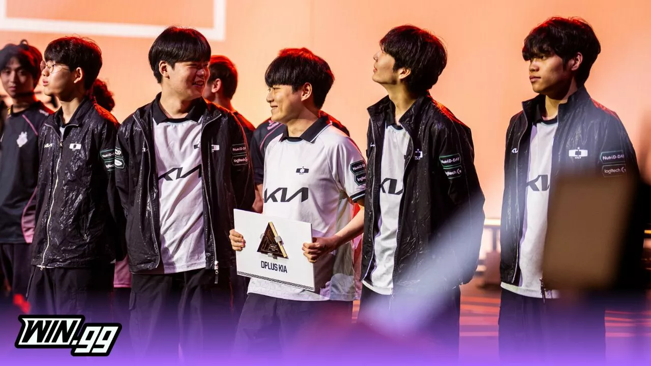
Dplus sweeps Karmine Corp to win the 2026 LoL EWC grand final
Hannan Mundia
The League of Legends Esports World Cup 2026 grand final just concluded, where Dplus absolutely swept Karmine Corp to win it all. The League of Legends Esports World Cup may only have been taking place since 2024, but it has already become a key international event for fans and professional players. With a large prize pool and consecutive matches with little delay, fans have a blast seeing their favorite teams ...
 Esports Betting
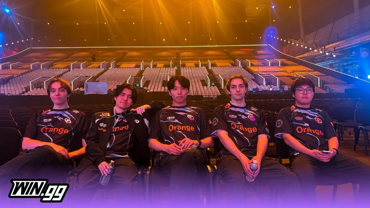
Dplus vs Karmine Corp: Best betting odds, picks for Esports World Cup 2026 grand final
Hannan Mundia
The League of Legends Esports World Cup 2026 grand final matchup has been determined, but which team will come out on top between Dplus and Karmine Corp? While there were multiple favorites going into the LoL EWC 2026, few assumed that Dplus and Karmine Corp would make it to the grand final. Both teams have showcased exceptional growth, but only one team can win the top prize. While Dplus is ...
 League of Legends
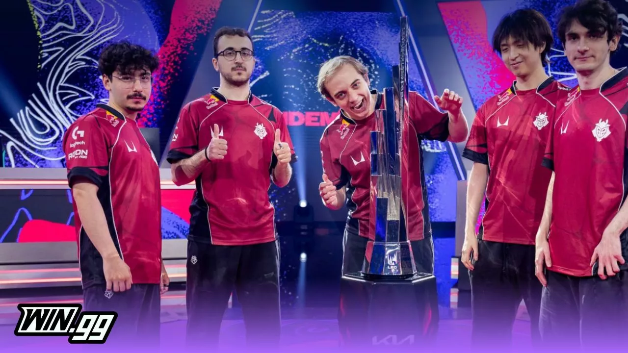
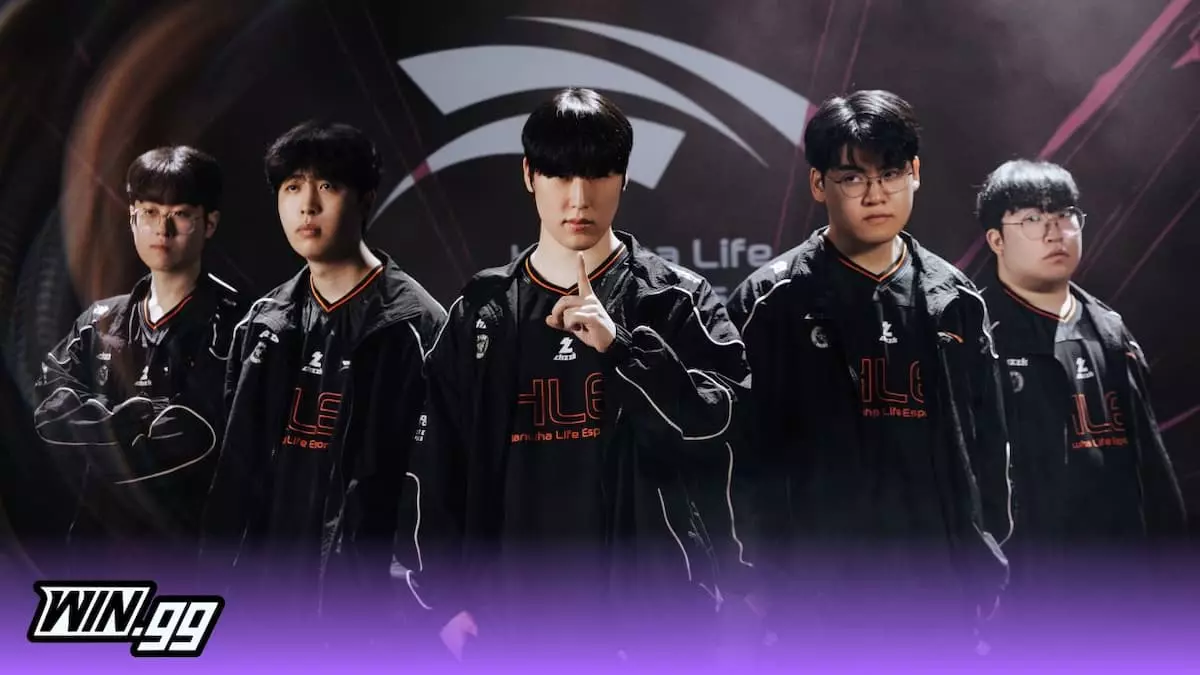
League of Legends EWC 2026 group stage recap: G2 crash out as T1, Gen.G and HLE advance
Hannan Mundia
The League of Legends EWC group stage just concluded, and here’s a complete summary of everything that transpired in the two extremely eventful days. The League of Legends Esports World Cup is already making waves for all of the right reasons. While it isn’t nearly as long as the game’s esports fans are usually used to seeing, it’s still packed with awesome matches in which the best teams play each ...
