The five worst Overwatch League Season 3 jerseys in 2020
The Overwatch League community has offered a chorus of “this ain’t in chief” in response to the 2020 jersey collection.
Unlike traditional esports jerseys, which aim to utilize the organization’s colors and logo in some way, Staple Pigeon’s new designs has most players wearing solid and plain jerseys with a stripe across the front, featuring each team’s home city in the team’s chosen font.
While fans are already marveling at the higher quality of these jerseys compared to last year’s Fanatic disaster, it seems like that’s where the compliments end and the complaints begin. Fans are underwhelmed with the uniform design, mostly because there’s no player name on the backs of the jerseys and the teams’ logos are not prominent enough.
It only makes sense for the jerseys to reflect the teams’ home bases now that the league has gone completely global this year. But we can still marvel at some of the uglier jerseys coming to the OWL stage this year.
5. Atlanta Reign, away jersey
For $90, this plain black jersey with slightly less black accents can be yours! Atlanta Reign’s away jersey is definitely not the most exciting, but being so plain keeps it from being totally offensive, hence why it’s only in the fifth place spot on this list.
For a team so full of personality, this is definitely an underwhelming look. The “REIGN” text on the bottom of the back is barely visible, making this already bland jersey even more plain than it otherwise might have been.
4. Toronto Defiant and Paris Eternal, away jerseys
Out of all the plain black jerseys with a red banner, these two are definitely the worst. It was hard to pick, since all of the plain black jerseys with a red banner were very similar. But these two had the worst fonts, making them just a little worse than the others.
It’s hard to tell what their team’s personality or logo is when their font is just straight Arial. At least they’re not in Comic Sans, and that’s something we can all be thankful for.
All of these jerseys would have been a lot cooler, and easier to tell apart from one another, if they had their logo in the background of the front of the jersey in the same faded black as their team name on the jersey’s back, hidden behind the banner. But what do we know?
3. Houston Outlaws, home jersey
This toxic neon green against plain white is terrifying. This is what actors in horror movies see when they close the medicine cabinet and then look up to see something behind them in the mirror. At least this jersey utilizes the team’s colors somewhat, as well as their font.
2. Philadelphia Fusion, home jersey
If this jersey doesn’t scream “sports referee,” we don’t know what will. We’re not sure what part of this jersey represents the Philadelphia Fusion brand, except perhaps for the font. Why not make the banner orange to give some sort of hint as to whose jersey this is?
Honorable mention: Los Angeles Gladiators, away jersey
We cannot forgive this Times New Roman banner.
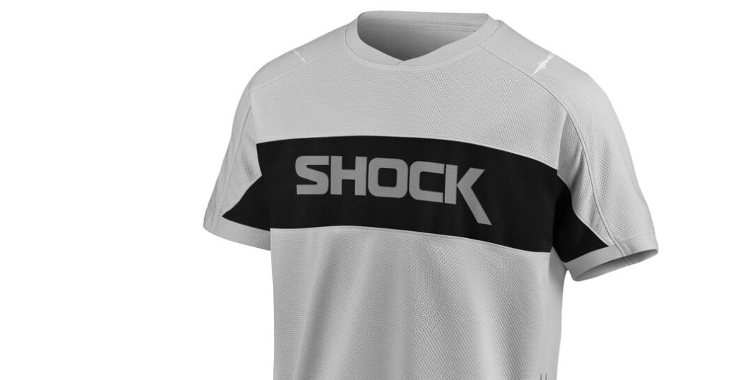
1. San Francisco Shock, home jersey
Ah yes. The San Francisco Shock’s signature grey and black team colors that we all know and love.
Actually, their colors are orange and white with a golden yellow accent. Okay, well… Seems like Staples has decided to toss those drab neon colors and their boring earthquake seismograph logo and opt for this much more recognizable and fun plain grey and black.
This jersey is definitely one of the most cursed creations for the 2020 season, and we think every Shock fan is in agreement that the only good thing about this jersey’s arrival is that last season’s jerseys are now 50% off.
Recommended

How many coins do you need to unlock everything in Mario Kart 8 Deluxe?
You’ll need a good amount of coins to unlock everything in Mario Kart 8 Deluxe.
The best Content Warning mods and how to install them
Let’s spice it up a bit.

What is The Hour of Joy in Poppy Playtime?
Here’s what went down all those years ago…

