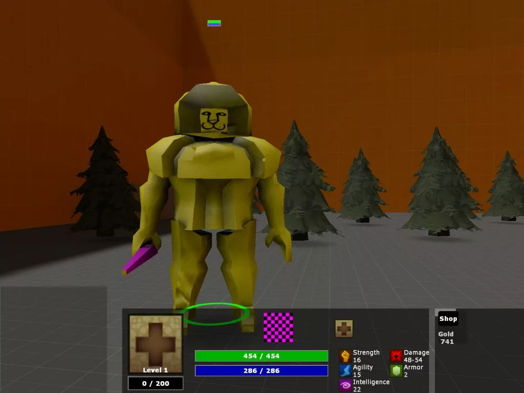
Lion is one of the most popular supports in Dota 2, but no one would pick him if he still had this ridiculous prototype model.
A Dota 2 developer has revealed a very early prototype image from the game’s production. While there’s a lot to be learned from the image, it most importantly features a placeholder model for Lion that must be seen to be believed. Modern Dota 2 players may also recognize other modern elements from the early internal test. Here’s how the image surfaced and what makes it so special.
Lion prototype makes Dota 2 players laugh
The image was posted by Dhabih Eng, a conceptual artist who has worked on multiple Valve projects. On September 21, he posted an image from early Dota 2 development to
his social media. The image shows a screenshot from a very, very early version of the MOBA.
Thanks to Dhabih Eng’s comment, we know that the character depicted in this early image is supposed to be Lion. The sinister sorcerer often confuses players with his predatorial name, and it clearly had some impact on his early development.
The tiny face only takes up about a fifth of his head, and the rubbery yellow material makes Lion resemble Spongebob Squarepants. The tiny hot pink wand may have eventually turned into his iconic demon finger but here it look likes a grape popsicle.
As for why this model even exists, video game developers often use placeholder models and textures during development. This allows them to roughly visualize what the game will look like in motion. These models are gradually phased out of the game as new assets are created. One of these wacky models could exist for all of the initial heroes released in Dota 2.
Dota 2 prototype screenshot shows rough early UI
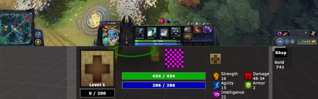
In addition to the hilarious prototype Lion model, this rare image also gives interesting insight into the development of Dota 2’s UI.
In this rough early interface, hero attributes are positioned on the right side of the menu bar with very basic graphics to show stats and gold. Strength, intelligence, and agility use different symbols and colors that differ greatly from their current appearance. Instead of abilities, most of the hot bar is blank with the Source engine’s classic purple-and-black checkerboard texture.
However, some of the DNA of this early prototype is still present in the modern game. In fact, the modern UI redesign from 7.00 returned the empty spaces between the mini-map, hero info, and shop tab.
Multiple important stats including armor and damage are both shown on the right side of the health bar, and the stack bars have stayed true since early development. You can even spot a small mana and health bar floating above Lion, showing that it was a very early design choice.
Dota 2 looks like a completely different game now compared to its initial 2013 release and prototype images like these show that the game has evolved even more than fans thinks.

 Dota 2
 Dota 2
 Esports Betting
 Dota 2
 Dota 2
 Dota 2
 Dota 2